Photography Friday: Leading In
There are a few "rules" about composition that are generally followed. You are never tied to these rules, they merely serve as a guide or starting point because when added, they increase interest in the image. However, there are many cases where the rules are "broken" and the image is better for it. But today we will talk about a basic one: Leading In. Actually, I don't know if there is another title for it, I'm just going to call it that today. haha
You eye naturally reads an image starting from the bottom left and up to the top right. It just naturally does this even though you may not realize it. One composition "rule" is to have a lead into the image. We'll start with this image:
(I just snagged some older images that aren't to great in many ways but serve this teaching point well so get over it. lol)
His hat tail leads you into the image starting from where your eye wanted to enter the image. But it also stopped where your subject stopped so your eye doesn't just wander off the page.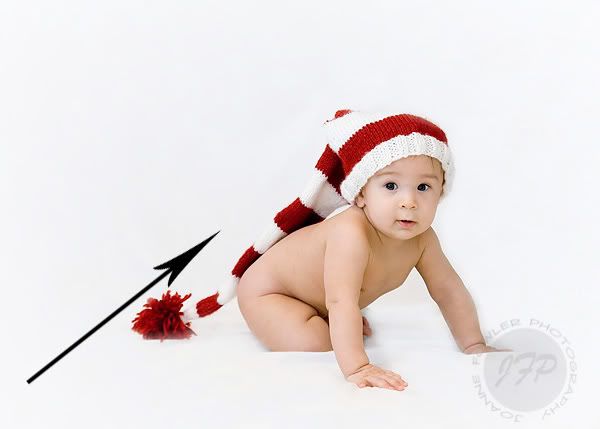
The dark red in the hat and his dark eyes contrast with the white background so your eye stops at his head. There is nothing distracting in that corner to make you keep going. The viewer will look at this image, start with the fun hat and end at his cute face and stay at his face. Exactly what you want them to do. Once you hit his face, it's hard to bring yourself to look at the arms, you want to stay at his face. Especially if it's your kid. Then it doesn't matter what the rest of the image is, Grandma will want 10 of these. lol And if they stared at it long enough they might examine the other details in the image like those chub rolls and nakey bottom. =)
This next one doesn't have the same exact angle leading in but it also leads in...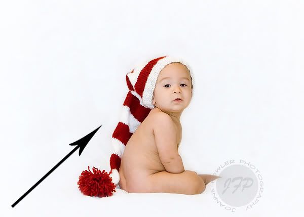
Again, his dark eyes and skin tone keep you looking at him and not going off to the top right. His arm might lead you next down his body where you notice the nakey.
Sometimes you break the rules. Sometimes you just use another rule. It just depends on the image and what you want the image to say.
This one doesn't really use the lead in. If you want to stretch and say his hat is leading in, go ahead. But this image really uses another one...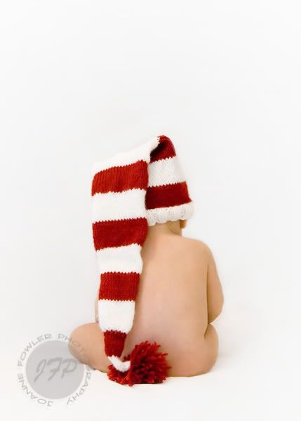
Another rule I don't know if it has a name. lol Sometimes you can keep the interest of the viewer but creating a frame of sorts. This "frame" is created by the subject. You start following his hat up to his head and it bends and goes back down his body to the hat tail/ball and then around and around again.
Again, you may not realize your eyes are doing this but you will stay looking at the image longer then if it had nothing keeping your interest on the subject.
These leads in and around don't have to be so obvious. Sometimes you will not even notice you are doing them but you like what you see.
If you want to take better pictures, you need to look past the cute face making you love the image and focus on some other aspects. But never stop taking pics that aren't just so perfect because you will miss some that are awesome because of the cute face.
Some random other examples:
Leading in and stopping at the contrast of her face/dark hair...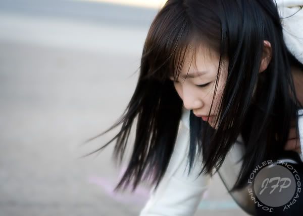
Kind of leading in up his back and stopping at the contrast of dark eyes and huge light forehead. lol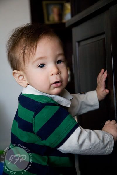
Framing: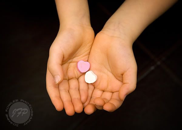
I see that I need to decide on a topic for Friday much earlier so I can post more updated images and not the same ol' images that you've already seen on this blog. SORRY! I will include one new one in the MM section at the end of this post, K? =)
Any Q's? Any suggestions for future Fridays? Leave me a comment!
(If you are not a blogger, you can click "anonymous" and leave a comment that way. Just include your name so I know who you are, please!)
{Mommy Moment}
(New image!)
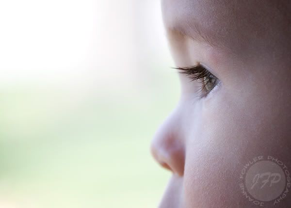
Seriously... these lashes should be illegal, right?